
Mobile design mistakes are one of the biggest reasons why users abandon websites in 2025. With more than 60% of global traffic coming from smartphones, your website must be optimized for mobile-first experiences. Businesses that ignore this reality risk losing sales, damaging their brand, and frustrating customers. In this article, we will uncover the most common mobile design mistakes and how to fix them so your users stay engaged and satisfied.

10 Proven Mobile Design Mistakes That Crush UX in 2025
Why Mobile Design Matters More Than Ever
Mobile-first indexing by Google means your mobile site is now the benchmark for rankings. A poorly optimized mobile site can lower visibility, reduce conversions, and create barriers for accessibility. The competition in eCommerce and services is fierce, and small mistakes in mobile UX can cost you big.
Websites that succeed in 2025 are the ones that prioritize speed, clarity, and usability. According to Statista, users are likely to abandon a site if it takes longer than three seconds to load. This shows how unforgiving today’s mobile users can be.

1. Slow Loading Speed
One of the most damaging mobile design mistakes is slow speed. Large images, poorly optimized code, and heavy plugins can make your site drag. When users wait, they leave, and when they leave, your competitors win.
How to Fix:
- Compress images using tools like TinyPNG.
- Use a content delivery network (CDN).
-
Audit plugins and remove unnecessary ones.
For a deeper guide on performance, check out our earlier post on Core Web Vitals and eCommerce speed optimization.
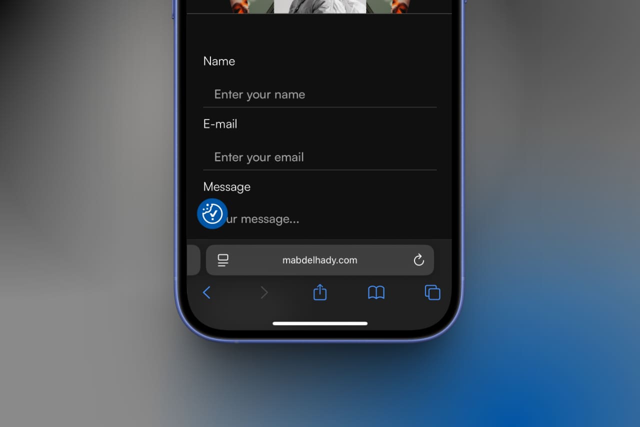
2. Poor Touch Targets
Buttons that are too small or links that are too close together frustrate mobile users. People interact with their thumbs, not a mouse, so you need to design for comfort and precision.
How to Fix:
- Ensure tap targets are at least 44×44 pixels.
- Add enough spacing between interactive elements.
- Test your site on different screen sizes.
3. Intrusive Pop-ups
Pop-ups that block the main content create friction and hurt the user experience. They are also penalized by Google’s mobile-friendly guidelines.
How to Fix:
- Use exit-intent pop-ups instead of immediate ones.
- Keep them small and easy to dismiss.
- Only show relevant offers.
4. Ignoring Accessibility
Accessibility is not optional in 2025. Overlooking features like screen reader compatibility, color contrast, and keyboard navigation excludes a portion of your audience. This is not only a mobile design mistake but also a legal risk.
How to Fix:
- Use alt text for images.
- Check contrast ratios.
- Ensure ARIA labels are present.
For more on accessibility, visit the W3C Accessibility Guidelines at w3.org.
5. Cluttered Navigation
Mobile screens are small, so complicated menus overwhelm users. If customers can’t find what they need quickly, they will leave.
How to Fix:
- Use a hamburger menu for secondary links.
- Prioritize essential navigation.
-
Add a search function.
6. Hidden Contact Information
Users want quick access to support. If your phone number, email, or chat option is buried, it creates frustration.
How to Fix:
- Place contact info in the footer.
- Use sticky buttons for “Call Now” or “Chat.”
-
Make forms short and easy to complete.
7. Non-Responsive Design
A common mistake is designing only for one screen size. Mobile devices vary greatly, so a rigid layout will break your design.
How to Fix:
- Use responsive frameworks like Bootstrap.
- Test across multiple devices.
-
Avoid fixed-width elements.
8. Overuse of Animations
Animations can enhance a design, but too many slow down the site and distract users. Mobile users want simplicity, not complexity.
How to Fix:
- Use animations sparingly for emphasis.
- Ensure they are lightweight and optimized.
- Avoid autoplaying animations.
9. Ignoring Dark Mode
Many users prefer dark mode for comfort, but websites that don’t support it risk creating a jarring experience.
How to Fix:
- Use CSS prefers-colour-scheme queries.
- Ensure text is readable in both modes.
-
Test icons and logos for visibility.
10. Weak Call-to-Action (CTA) Placement
CTAs that are buried or hard to tap reduce conversions. A strong CTA should be visible, clear, and designed for mobile users.
How to Fix:
- Place CTAs above the fold.
- Use contrasting colors.
- Keep text short and action-driven.
Mobile design mistakes can ruin even the most beautiful website. Speed, usability, and accessibility should always come first. By fixing these 10 proven mistakes, you will deliver better user experiences, improve your SEO, and convert more visitors into customers.
If you want professional help optimizing your website for mobile, visit our blog for more resources and insights.