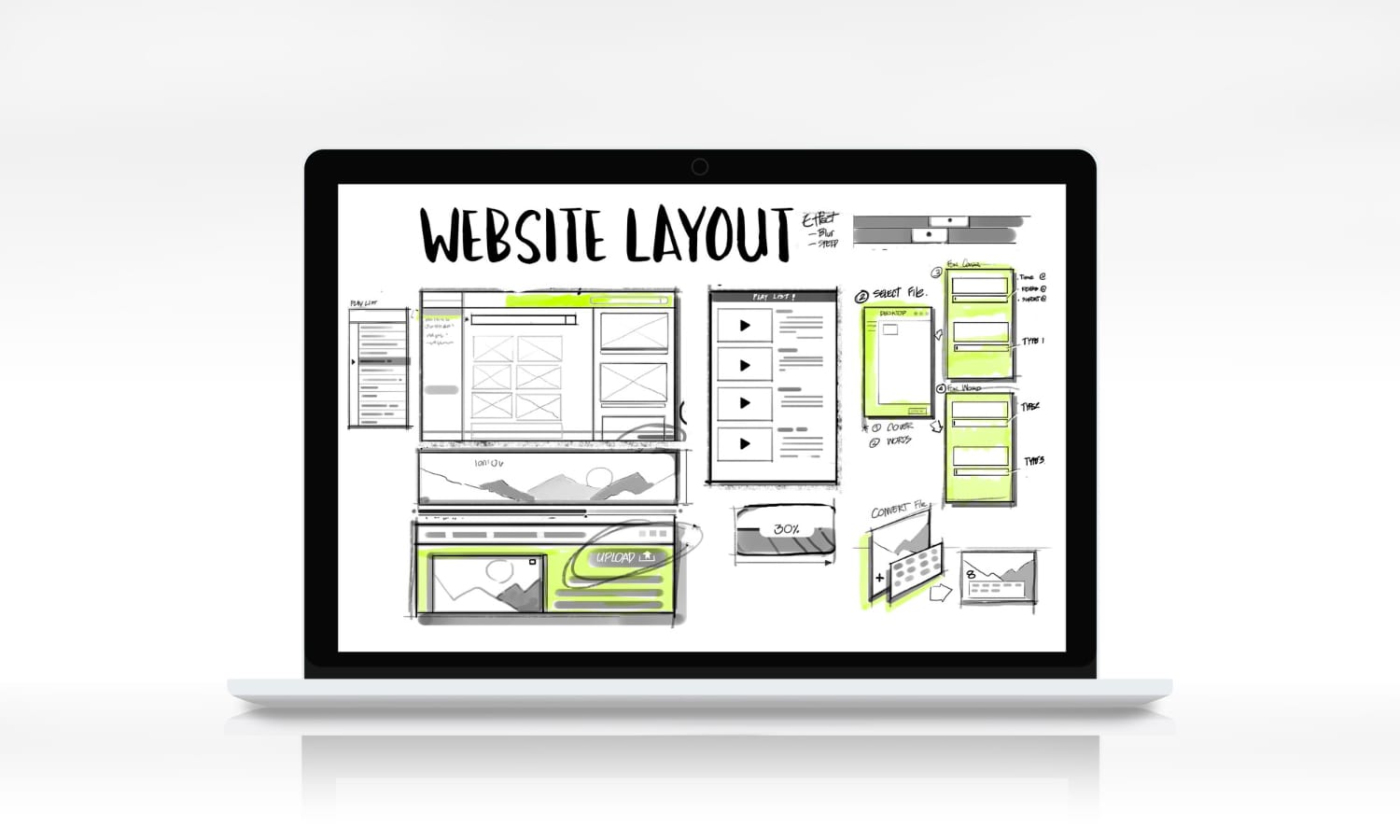
2025 Website Redesign Checklist: 21 Must-Do Steps for Speed, UX, and SEO
The 2025 website redesign checklist is more than a catchy phrase. It is a plan that keeps your project on track and focused on what users and search engines expect this year. Design tastes change, frameworks evolve, and Google keeps raising the bar for speed and usability. If the last redesign was even a couple of years ago, it is time to rethink structure, content, performance, and accessibility with a practical, step-by-step approach.
Below is a complete checklist that a small team can follow without getting lost in jargon. It is split into strategy, UX and content, performance and tech, accessibility and compliance, and launch and growth. Work through each section, and you will have a modern site that loads fast, reads clearly, and converts.
2025 website redesign checklist
Strategy and planning
1) Define one primary goal per page
Every page should do one clear job. A service page books a call, a product page earns a sale, and an article wins a subscriber. Write the goal at the top of the brief so everyone designs and writes toward that single outcome.
2) Map the journeys that lead to that goal
List the top entry points, the questions people ask, and the steps to the action. Trim dead ends. Add helpful links where people usually hesitate. Clarity beats cleverness.
3) Choose a tech stack you can actually maintain
Trendy frameworks are tempting, but maintenance is what keeps sites healthy. If your team lives in WordPress, use it well. If your store runs on Shopify, lean into its strengths. If your app needs React 19 features like improved forms and server actions, plan the upgrade path early and test for breaking changes. React 19 stable releases and documentation are available, so plan with official guidance rather than guesses.
4) Set a performance budget before design starts
Decide targets for Largest Contentful Paint, Cumulative Layout Shift, and Interaction to Next Paint. INP replaced First Input Delay in March 2024, so measure responsiveness with INP going forward. Put the targets in your design system so every decision supports them.
5) Write real copy first, then design around it
Design suffers when fake text fills the page. Draft the key headings, summaries, and calls to action first. Short sentences, useful subheads, fewer buzzwords.
6) Build scannable sections
Use H2 and H3 headings, short paragraphs, and helpful bullets. People skim before they read. Make the first line of each section carry the message so a quick scan still delivers value.
7) Strengthen product and service pages
Answer the questions buyers ask: what is it, who is it for, why choose it, how much, what’s next. Add trust blocks such as reviews, certification logos, guarantees, and clear returns or support info.
8) Create comparison and resource hubs
Cluster content into useful hubs. A “Services” hub can link to each service page. A “Resources” hub can group guides, templates, and checklists. This helps users and gives search engines a clear structure.
9) Add media with intent
Use images that clarify, not just decorate. Keep the text near the images it explains. Add short video clips for product demos or complex steps, and always include captions.
10) Design components that adapt to container queries
Instead of fighting the viewport, design components that respond to the space they sit in. CSS container queries let you change layout and typography based on the size or style of the parent container, which simplifies responsive design for cards, nav bars, and product tiles.
11) Use the :has() selector for smarter UI states
The :has() pseudo-class lets CSS react to the presence of child elements, which opens up new patterns like styling a card if it contains an image or toggling a label if a related input is focused. Support has grown across modern browsers, and MDN outlines usage and constraints, such as avoiding nested :has() selectors.
12) Add smooth navigation with the View Transitions API
The View Transitions API helps create clean page or state changes in both SPAs and MPAs. Use it for tasteful page fades, list to detail transitions, or layout swaps. It improves perceived smoothness without heavy JS animation libraries. Chrome’s docs and MDN show examples and support notes.
13) Optimize images and fonts early
Pick next-gen formats like WebP or AVIF where possible. Serve responsive sizes with <img srcset> and <picture>. Self-host critical fonts, subset them, and use font-display: swap. Test on slow networks, not only on office Wi-Fi.
14) Measure and fix Core Web Vitals
Ship lightweight pages. Lazy-load noncritical assets. Reduce JavaScript on first load. Replace heavy carousels and blockers. Keep animation subtle and GPU-friendly. Track INP in lab and field data so real taps and clicks feel instant.
15) Prefer progressive enhancement
Start with accessible HTML and working links, layer styles, then add JavaScript for richer behavior. This approach keeps the site usable on older devices, search-friendly, and easier to debug.
16) Treat third-party scripts as a budget line
Audit tags for chat, analytics, and widgets. Many scripts slow down the first paint and hurt INP. Keep only what helps conversions. Load heavy tools after interaction or on specific pages.
17) Meet WCAG 2.2 basics on every page
Aim for readable color contrast, logical heading order, clear focus states, keyboard navigation, form labels, and descriptive alt text. Accessibility is good for people, rankings, and conversions. It also reduces risk and rework later.
18) Write forms that people can complete
Minimize fields, add clear errors, and show progress. Align labels with fields. Let browsers autofill and validate. Respect privacy with simple, honest language.
19) Respect privacy and security from day one
Use HTTPS everywhere, secure headers, and strong content security policies. Keep dependencies up to date. Show a plain-English privacy policy and cookie choices that actually work.
Launch and growth
20) Track what matters, not everything
Set up analytics with events tied to your page goals: calls booked, carts started, checkouts finished, forms submitted. Monitor Core Web Vitals in Search Console and your RUM tool. Review logs weekly for errors and slow routes.
21) Plan post-launch sprints
A launch is a starting line, not a finish line. Book two or three quick sprints to polish navigation, fix content gaps, and tighten performance. Keep a backlog of small wins that add up fast.
Practical stack notes for 2025
- React 19: If you use React, review the v19 changes, the upgrade guide, and notes on deprecations. Plan testing in staging with real user flows before shipping to production.
- CSS features to embrace: Container queries and the :has() selector reduce JS and make components smarter. Start small on critical components, then expand once you are happy with support and patterns.
- Transitions that feel native: The View Transitions API can replace heavy animation plugins for many cases, improving smoothness without bloat.
- Vitals reality check: INP is now a Core Web Vitals metric, so test responsiveness as a first-class goal. If a tap or click feels sluggish, fix it. Google’s announcements confirm the change and provide guidance.
For a detailed overview of the INP change and how to measure it, read Google’s post on introducing Interaction to Next Paint. It explains what good looks like and how to improve it in practice.
Common pitfalls that quietly kill a redesign
Trim the waste, keep the helpful parts, and always favor speed and clarity.
Tools and checkpoints